
Inside the Studio, why I build my palette with Michael Harding Oils
Every painting is a conversation between the artist’s vision and the physics of their materials. Over years of developing my practice, I’ve learned that the tools we choose are never just utilities—they are an extension of our voice on canvas. Visitors to my studio often notice the rows of distinct silver tubes lining my workspace. Today, I want to pull back the curtain on why I paint exclusively with Michael Harding Artists' Oil Colours and share a deep dive into the exact palette that shapes the work you see on Brian Millar Fine Art.
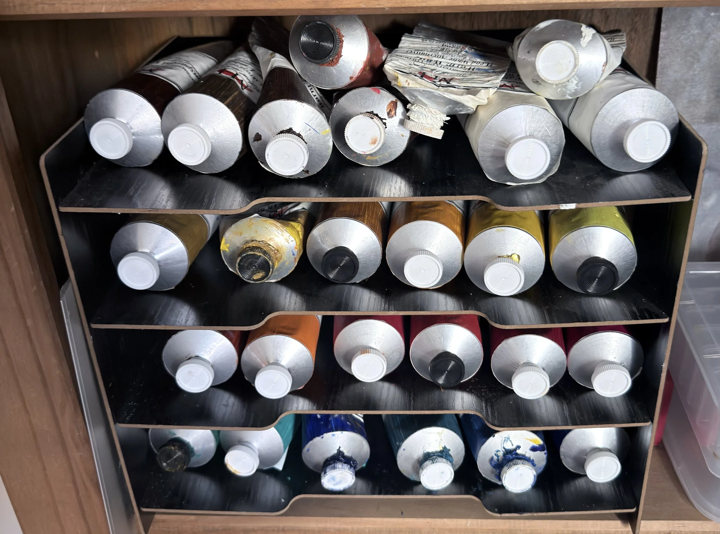
My paint rack
Every artist goes through a period of trial and error with materials. Early in our careers, we often fight against chalky student-grade mediums or mass-produced paints loaded with artificial fillers.
After initial use of student grade oil paints and realising the oil was the direction I wanted to go, I upgraded my paints to Windsor Newton professional oil paints. I did enjoy using these paints, but I wanted to look for a brand that was softer in texture and of a higher quality. When I originally started painting, I had the luxury of a steady income from a full-time job. This allowed me to look at more expensive premium products.
After ordering a few different brands from Jackson's art stores, I realised that the Michael Harding Brand was the one for me. In addition to it being a UK company, it just felt right to explore this brand further. Initially, I purchased all the paints in 37ml and 60ml tubes. When I realised I wanted to paint more, I decided to start purchasing the larger 225ml tubes, although more expensive at the time, that does save you money in the long run. The good news about oil paint is that it lasts for years, so none of this investment will be wasted.
Although from the photos shown below, you can see I have many different tubes of paint, I permanently stick to only a few on the palette as a starting point for all painting.
Michael Harding famously started making his own paints in London in 1982 because he was dissatisfied with commercial options and wanted to recreate the depth, vibrancy, and structural integrity of the Old Masters. Knowing that another artist engineered these paints entirely for the love of the craft makes a massive difference before you even open a tube.
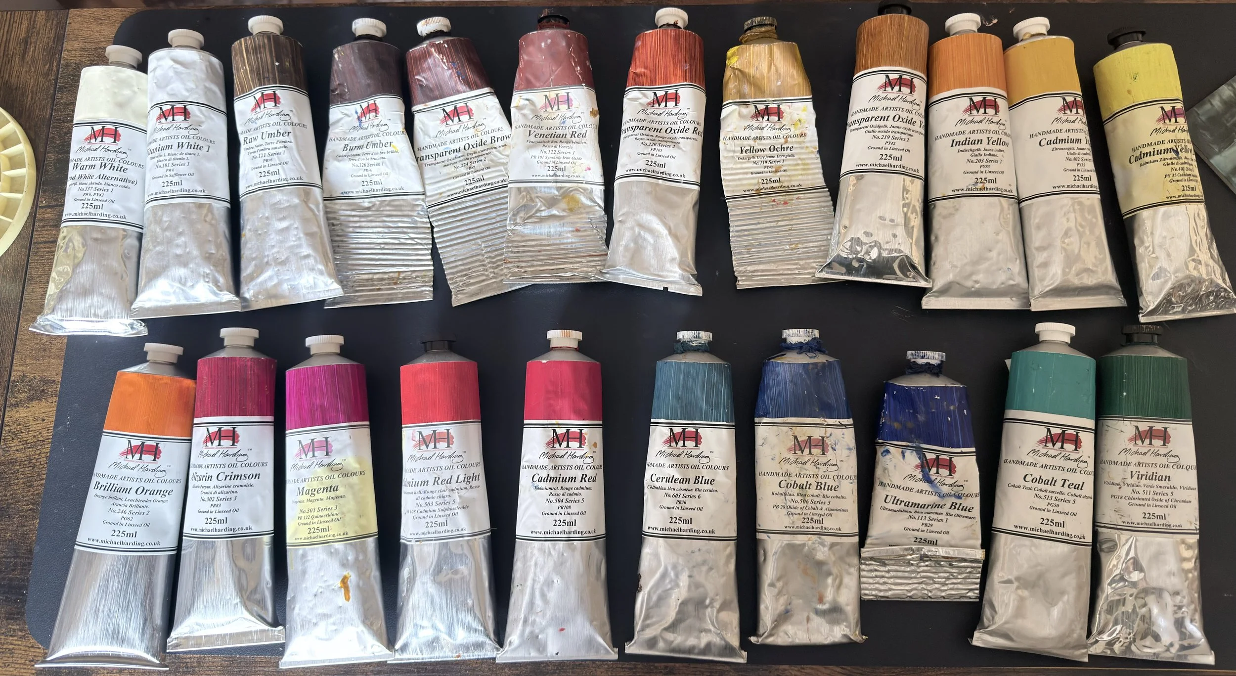
My range of 225ml tubes of paint.
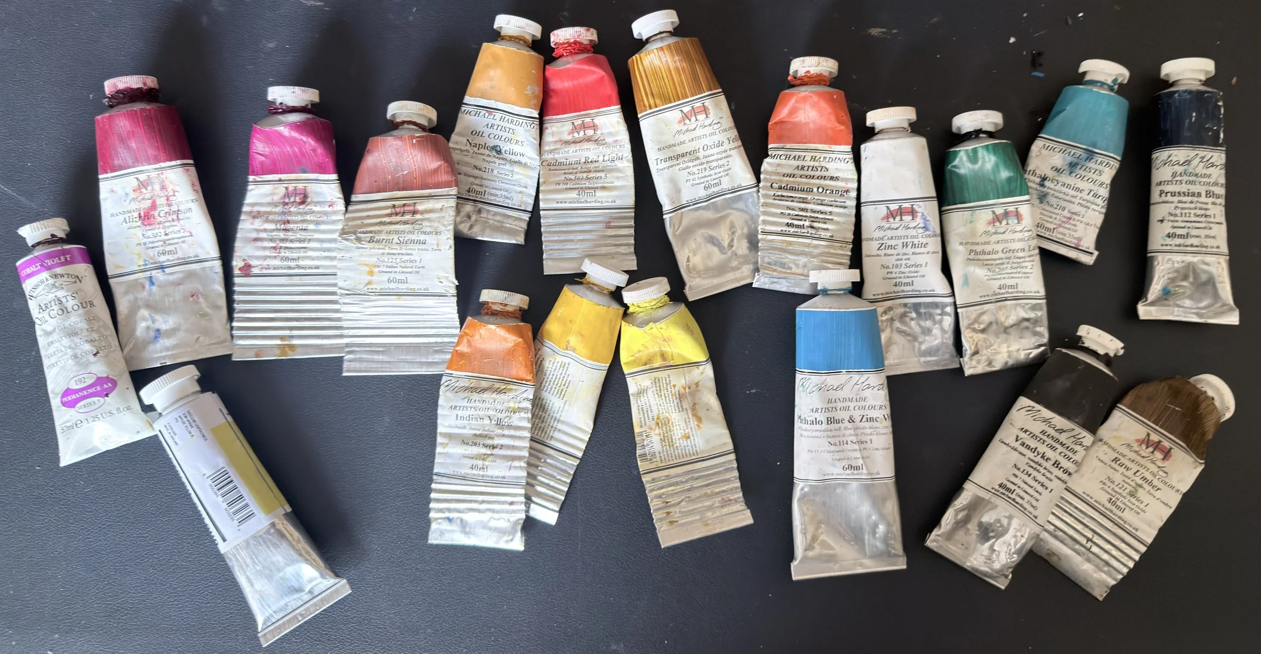
Some older smaller tubes and some experimental colours.
The Anatomy of an Unadulterated Medium
What sets these paints apart isn't a secret formula—it's the absolute lack of one. Michael Harding completely refuses to use fillers, extenders, or universal driers to alter the paint.
Because there are no universal chemicals forcing the paints to behave uniformly, every single tube retains its own raw personality:
• The Pigment Load: Without fillers diluting the volume, the pigment concentration is exceptionally high. A single squeeze packs incredible tinting power, making it highly cost-effective in the long run.
• The Texture: It possesses a rich, buttery, and slightly elastic body that holds the precise tooth of a brushstroke or palette knife without deflating or slumping on the canvas.
• True-to-Life Labels: If you look closely at the tubes on my workbench, you’ll notice a stripe of color across the front. Those aren’t printed ink. Every single label is hand-painted with a real swatch of the oil paint inside, allowing me to see its exact opacity, finish, and undertone at a glance.
Deconstructing My Palette
To give you a clearer picture of how I build my surfaces, I’ve mapped out my primary working palette based on pigment characteristics and behavioral roles.
The table shows a few elements of how I use the majority of the paints.
The colour choices include an indication of the colour (not exact due to using colour‑picker software).
The colour temperature — this is of course subjective and depends on the context of the surrounding colours. However, you will see from my primary palette that I usually start with two of each primary: one cool and one warm, in addition to using a cooler and a warmer white and three earth colours.
The colour reference for each pigment: should you use a different brand, these references should remain consistent across brands.
Which paints I use as my baseline palette.
Brief description of each paint.
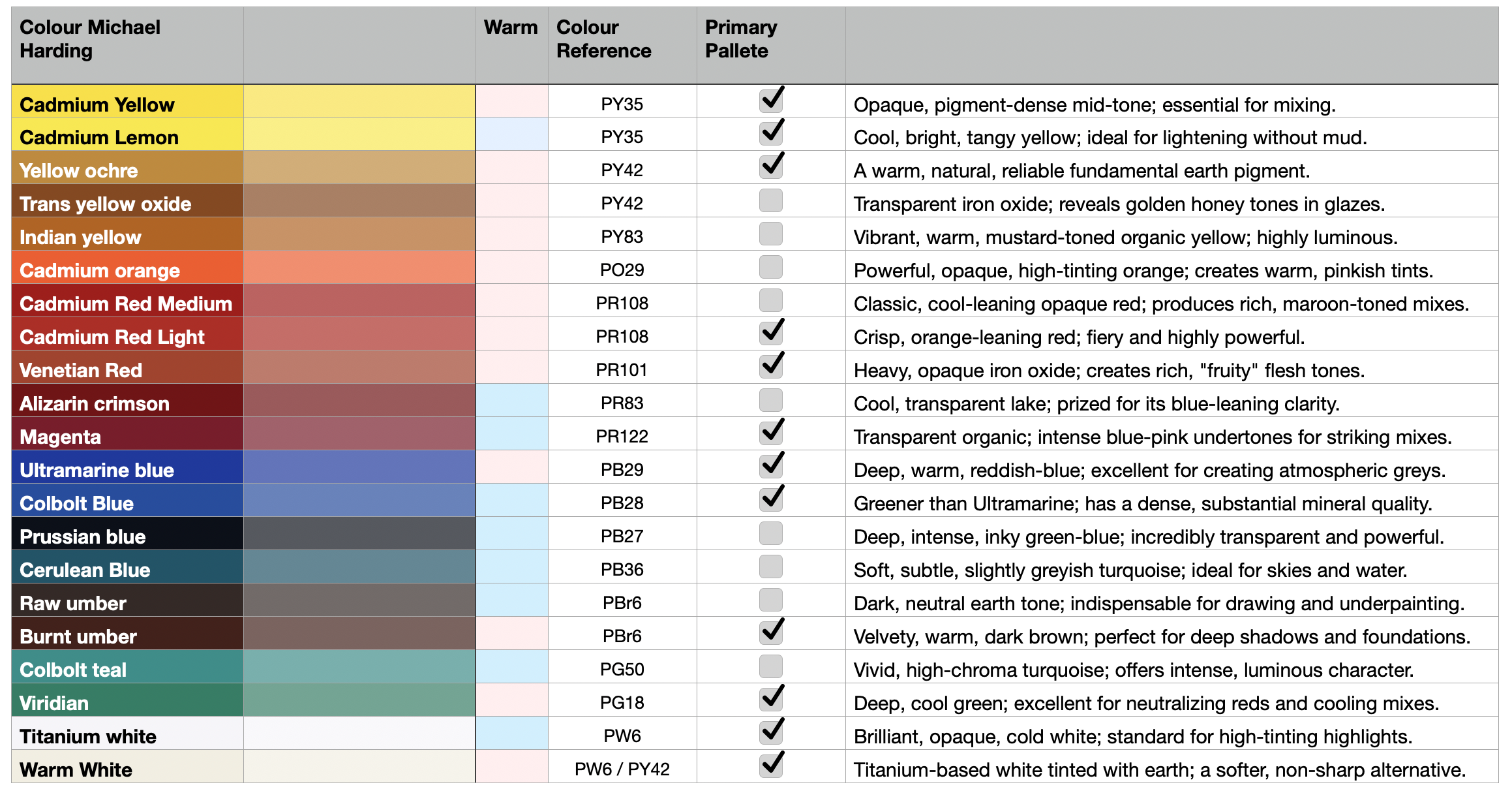
Table of my main paints I Use
The Power of Glazing & Scale
Beyond my primary mixing colours, I frequently lean on highly luminous, transparent options like Indian Yellow (PY83) and Transparent Oxide Yellow or Red. I find these pigments especially useful because they allow light to pass completely through the paint film and bounce directly off the white canvas underneath, producing a warm, glowing depth and subtle inner luminescence that opaque paints simply cannot replicate. I often use them in the underpainting to create depth especially in shadows and in thin glazes and layered passages to enrich colour shifts and create a sense of air and presence in the work.
Working Practice
My most common working practice is to work in layers. The paint I use enables me to do this to a high standard from the very beginning. Originally I start with an under drawing using transparent paints over a yellow ochre primer also from Michael Harding's. Once this is dry, I lay down my initial paint layer blocking in the larger shapes and focus on values, at this point I do move to use more to pick pants. From this point on I may add one or many more layers and in some cases finalise the painting with some glazing using some of the transparent paint. In a later blog, I will go into a great more detail on my process.
Crafting Art to Last
Investing in pure, unadulterated pigments isn't just about how the paint feels under my brush today; it's about how the painting will look centuries from now. By using materials with excellent lightfastness and zero chemical fillers, I know that the surfaces I build will remain stable, radiant, and structurally sound for generations.
When a collector acquires a piece from my portfolio, they aren't just taking home a visual concept—they are investing in a physically archival object crafted from the finest materials possible.
To see these pigments in action, explore my latest collections on the Brian Millar Fine Art Gallery Page.
